Welcome

Thank you for visiting my blog. I hope you find interesting ideas and inspiring images. Any feedback or suggestions would be appreciated! Check out my facebook page.

About Me

My photo
My name is Gerrie Wydeven doing-business-as Wydeven Designs. I have been conducting this small GREEN business since 2004. Wydeven Designs, based in the Atlanta, Georgia area, sells CHAIRS, LOVESEATS, CHAISES, SETTEES and other fine, well-constructed refurbished upholstered pieces. I love to travel, cook, take photographs and generally follow style and decor topics as well!

Friday, April 29, 2011

Color Combinations - Working with Greens

Using green in home decor is a popular choice for many people - including me.  My bedroom is mostly an apple green (with deep rose accents) and my den where I am now working is a sage green (with burgundy sofa).  I looked at a couple of references on using greens and found the following that I thought were useful:


Sage (sold)
There are specific words that come to mind for the color green.  Words like nature, calm, serene, soothing and 'Spring'.  

Muted shades of green such as olive, moss, and sage are more at home in relaxed country decor homes. The darker, richer shades of forest green and bottle green are traditionally used in more formal style homes.


...the glory of green is that it is one of the easiest of colors to mix with itself: you can put any number of greens together and be confident that they will work.


Apple Green Set (sold)

Apple Green and White (sold)

The complementary color for the color green is red … an even balance of a shade of green and red with the addition of white makes a great color scheme.

Green with Red/Orange (sold)

Green with Cranberry (sold)

Green with Rose Wingback


Wednesday, April 27, 2011

Color Combinations - Working with Reds

Once we get past all the blues (with white, with yellow, with anything), I gravitate toward reds in my decor.  My living and dining rooms are predominantly reds - anchored by traditional Chinese rugs.

My  Dining Room
There are many shades of red depending on the blue or yellow added to the primary color.  One source I found suggests the following "best matches" - some very interesting ideas:

Tomato - with pale olive or creams or cerulean or cobalt blue

Fire engine  -  with grayish mauve or plum or dusty apple green or white

Cranberry - with moss or burnt orange or sage or silver gray

Brick - with cool pink or greenish brown or deep bruised purple

Strawberry - with mocha or caffe latte or pistachio or cream

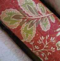
Cherry - with funnel green, milky white or deep burgundy.

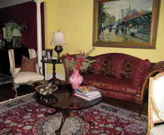
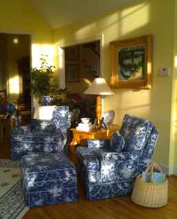
My Living Room (with Yellow, of course)

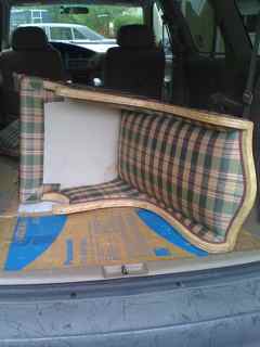
I have refurbished MANY wonderful pieces of furniture in reds and continue to buy great fabrics to use for the next rounds.  I have acquired some great ones that I will be using in the very near future.
Strawberry with Pistachio 
Lovely Tomato Ikat with Ecru and Cream
Cherry with Burgundy


Monday, April 25, 2011

Color Combinations - Blue and Yellow

This is the second in this series and continues to discuss MY personal favorites - I have four rooms in my house in the blue and yellow color scheme.   The yellow adds warmth to the cooler blue.   According to the designer, Roger Banks-Pye of Colefax and Fowler, this color combination is a little trickier than just blue and white which can be used in a "free-handed way".
Yellow and blue together are technically trickier partners ... when placed in juxtaposition they should be of equal color saturation, or one will kill the other ...
Customer Placement of Wydeven Design Chairs 
Blue and Yellow Toile on Vintage Chair (SOLD)

My Own Blue and Yellow Sunroom in Late Day Sun

Saturday, April 23, 2011

Weekend Update - Fabrics and other Buys

I am having another great weekend finding wonderful pieces of furniture begging to be refurbished and a great fabric sale at Fabric World in Stone Mountain (I keep sharing all my secrets - this one is a good one  for the Atlanta area locals).   Most of their fabrics are $3.00 a yard for an unspecified timeframe (at least they wouldn't tell me).  I stopped by Friday expecting not to be too impressed but ended up buying 150 yards!  Here's the scene and some of my buys:

Fabric World Fabrics on Sale

Some of my Purchases

I also bought the following furniture at various estate and garage sales (and have a bid in on two bergere chairs - probably won't get those since I bid fairly low):

  • Two cane-sided wingback type chairs (3rd set like this I've redone - turn out beautifully - see similar long-sold one below)
  • Straight Chippendale leg wingback chair (another Vicki Chair)
  • Tight-back settee with rolled arms, single large cushion and carved front legs
I am still thinking about 10 or more fabrics that I really SHOULD have bought and may drag a friend who also loves fabrics with me on Monday to check them out!  

Friday, April 22, 2011

Color Combinations - Blue and White

This is the first in a series about colors and color combinations.  I LOVE blue and white together and judging from all the decorating magazines I get (and I think I get them all), it continues to be a perennial favorite for many people.  I have this combination throughout my home (reinforced by lots of blue and white Delftware and other porcelain pieces).

Blue and White Vintage Chair 


I just picked up a Colefax and Fowler (all things English)  "coffee-table" book illustrating the work of one of their premier designers of the 90's - Roger Banks-Pye.  He LOVES this color combination "happily admits to a passion bordering on fanaticism" and features it throughout the book which became the inspiration for this series.

Banks-Pye offers these cautions about the use of blue and white (after saying they fit any decor and any room and any period):

  • dull northern light (exposure) will dull many blues - may need a red-blue
  • blue dyes are unstable and will fade quicker than others when placed in direct sunlight
Blue Floral 

He does suggest adding blacks in small doses when using very pale blues.  He also believes you can just keep adding different shades of blue almost forever "there is a danger of disastrous clashes only when just two conflicting blues are used in juxtaposition" - in other words, the more the merrier!

Multiple Shades of Blue
Blue and blue and white pieces are and have always been my best sellers!  All chairs illustrated are sold.

Blue and White Slipper Chair

Wednesday, April 20, 2011

Buying Furniture Online - Seat Heights

This is the third installation in this series about buying furniture on-line and gaining a comfort level with a purchase that you cannot feel, touch, sit-in, etc.   I have discussed color selection/matching and seat cushion composition previously.  This blog is about seat cushion heights and a little about width and depth.  The standard height (measured from the floor to the top of the seat cushion) of club chairs is 15-16" and wing back and other more formal chairs tend to be 18-20" (some even higher).   The standard seat depth (measured from front of seat to back) is 20 - 21".
Wingback - 20" seat height

Tapered Chairs - 17" seat height

Blue and White Chair - 16" seat height

Before buying on-line, it is a good idea to experiment and conduct some research about comfort levels in seat heights.  Start by sitting in chairs already in your home or going to a furniture store and sitting in various chairs - make sure you take measurements to determine what height works best for you.  If seat depths are too deep, it is easy to adjust with a lumbar or other accent pillow.

Tuesday, April 19, 2011

Buying Furniture Online - Seat Cushion Composition

This is the second,  nonconsecutive installation of a series on buying furniture on-line.  This one deals with asking questions about and/or judging the comfort of seat cushions.  You want them to be of sufficient softness or hardness to be comfortable for you.  Not everyone has the same requirements.

Down Seat Cushion
The softest cushions are mostly or all down and feather (the usual mix is 10-20% down and balance feather).  The cushions are not firm and must be "fluffed" occasionally to hold their shape.  I have my upholsterer add a layer of dacron wrapping on all down cushions to add a little heft to them.

Down Back Cushion and Wrapped Spring Seat Cushion
The combination of an internal set of spring (much like a mattress spring) wrapped with either down or non-down is very comfortable and has more firmness than the all-down cushion.  It is probably the best possible combination and is the most expensive seat treatment.

Wrapped Foam Seat cushion

The most reasonable (and most common) seat cushion is a form of solid foam core.  It is moderately firm and always holds its shape - as long as the foam core is of high quality.  As with down, I have my upholsterer add a wrapping of dacron to make the edges a little softer and add comfort.  This is a fine cushion for most seating areas.  


Monday, April 18, 2011

Craigslist Selling - My Fabrics

Bolts For Sale
The downside of buying as many fabrics as I do is that every now and then I do have to decide if I'm going to use each and every one and get rid of those that just never seem to be selected.  Fabrics take up a lot of space and are very heavy so this is an important task.  Following my internal clock (spring cleaning), I start sorting fabrics at least annually.  I have a staging area that grows and grows.  One benefit of this exercise is that, not infrequently, I "discover" a fabric long forgotten and develop a whole new excitement around it.  I probably do end up using at least 33% of these fabrics and get rid of the rest.


I have found that fabrics are very hard to sell since most people (who are not like me) do not want fabrics sitting around waiting for that right project to come along.  I try selling through the local craigslist and also during my own annual garage sale (some will be listed on eBay as well).  Finding the right listing category on craigslist is kind of tricky so I have listed the pieces I am currently selling in different areas of the list:


  • Furniture - By Owner
  • Materials
  • Arts and Crafts
  • Clothing and Accessories


If not sold through craigslist, I plan to donate to Goodwill!

Saturday, April 16, 2011

Estate Sale Weekend - Update

This has been a great estate and garage sale weekend.   I started out on Friday and went to three sales including one held by one of my favorite sellers - Vicki.  I bought a french style settee and left a bid for a pair of french style wingback chairs.  At Vicki's sale, I bought a really nice narrower wingback chair with a great custom finish.   She gave me a great deal!  

Vicki's Sale
 I learned today that the bid for the french style wing backs was accepted and picked them up as we were heading out for a local art festival.


Vicki's Chair 

 I had a great buying weekend:

*   Vicki's Chair
*   French Settee
*   Set of French Style Wingback Chairs
*   Two different Hancock and Moore Martha Washington Chairs
*   One tailored vintage chair (needing a lot of work)

French Style Wingback (one of a pair)
FUN!!!

Friday, April 15, 2011

Buying Furniture Online - Color Matching

I am starting a new series (probably won't run successively) about buying furniture on-line.  Many people, including me, are nervous about buying something on-line without feeling, touching, sitting on, etc.   I am often asked if a piece is "comfortable" or "firm".  The issue of color is probably the most difficult since there are so many opportunities for distortions - far beyond individual color-seeing acuity differences.  The primary two problems are the camera used to photograph and the screen used to view.

Camera:
Flash photography can cause the color to look different and also create the illusion of a sheen that is either not there or is exaggerated.  Color correctness may be hard to achieve even in natural lighting - it seems the most difficult for reds or other warm colors which often take on an orange or rosey tinge.

Viewing Screen:
Screen color displays can range widely - colors I see on different computers at home or on my iPhone or iPad all look slightly different.

Getting a swatch of the fabric is the best way to get the best view of the color.  Sometimes that is not doable or practical.  There are couple of things that help answer the questions about colors.

  1. Buy and use an Online Auction Color Chart link  This chart shows 100's of colors and allows the seller (if he/she can be convinced to use one) and the buyer to communicate more clearly about the colors in an online piece.  Even using the website has helped with some of my sales.
  2. Fabric Sample Against White
  3. Ask for additional close-up photographs of the item and, if possible, photographed near something that has a more universally known color.  For example, when asked about the level of creaminess or whiteness of a fabric, I take some photos near a white piece of paper.  I have also used Chinese red oriental rugs and traditional blue and white pottery as a counter-point for colors.

Fabric Sample Against White


Thursday, April 14, 2011

Goodwill Shopping Update - Locations

Baker Chair Purchased at Goodwill (SOLD)
I have written several times about shopping at Goodwill Industries Stores in the Atlanta area - and the great deals I get at the stores (I also donate to Goodwill - my ratio of donations to purchases is probably 65-35).   I have "friended" Goodwill on facebook and found this nifty site to find stores link to Goodwill Store locator.   I have been doing most of my shopping on Tuesdays since that is Senior Citizen Discount Day (a whopping 25% off for everyone 55 and older).  Maybe it's the economy (or should I quit doing so much advertising for them) but I am finding the stores more and more crowded and I am having a harder than usual time finding anything on my preferred items list.  In visiting four stores this week, I came away with only two small pillow inserts.  Well at least with the handy locator option, I'll just visit more stores!

Wednesday, April 13, 2011

Decorator Fabric Series - Crewel Design

This is my 7th installation of this series - I may give it a break and return later (there appear to be an unlimited number of fabric designs to discuss and illustrate)!

This blog is about crewel and crewel design - the look of embroidery over a flatter surface providing texture and interesting contrast.

I found the following definition:
A true crewel fabric is embroidered with crewel yarn (a loosely twisted, two-ply wool) on a plain weave fabric. Traditional crewel fabrics are hand-woven and embroidered in India. The design motif for crewel work is typically outlines of flowers, vines, and leaves, in one or many colors. Modern weaving technology and inventive designers create traditional "crewel" looks with weave effects alone, without the use of embroidery.
Antique Chaise in Green and Cream Crewel Design (SOLD)

Cheryl's Crewel Wing Back

Art Deco Chairs (PAIR) 
True crewels are hard-to-find and very expensive.  Crewel-like designs, however, are more reasonable and can be either striking or subdued.  I wish I could find more of these great fabrics!

Tuesday, April 12, 2011

Decorator Fabric Series - Checks

Large Woven Rose Checks (SOLD)

Small Brown and White Silk Checks (SOLD)

Small and Large Black and White Checks (SOLD)

Another installment - I hadn't realized when I started this series that there were so many patterns to discuss and illustrate.  This blog is about "checks" as distinct from plaids.  Checks can be large or small and woven or printed.  Checks work on all types of pieces and can add formality and symmetry to a setting.  I love combining florals and checks in the same setting as long as the colors and color values are comparable.

Hickory Chair Compact Clubs in Rose and Green Check

Monday, April 11, 2011

Decorator Fabric Series - Toile de Jouy

Blue and White Toile
Brown and Cream Toile
This is the fifth installation in this series about fabric patterns.  It discusses Toile de Jouy fabrics which are usually cottons or cotton blends and are printed rather than woven.  I love this fabric and get very excited if I can find it at a good price - it is that popular and never seems to go out of style.  I have had a set of blue and cream club chairs and ottoman for a long time (and also have a bathroom wallpapered in a green and white toile).   The fabric works well on all size pieces but I do try to use it on pieces that show the patterns - often scenes - the best.  I have passed up really large patterns as well as really small ones - the scale is important.   This is also a pattern that can stand the test of time - a little fading only renders it more authentic.  

I researched for a little history and found the following:

In 1760 Christophe-Philippe Oberkampf established a factory in Jouy-en-Josas printing French toile fabrics of superb quality with dye fast colors. By 1805 it sprawled over 14 hectares with over 1300 workers, becoming the most important factory in Europe.

In the beginning, the factory printed woodblock polychrome cottons mainly in botanical and fruit designs, to be used for clothing and some soft furnishing. These fine examples, called Toile de Jouy, simply meaning 'cloth from Jouy', became the most quintessential of French fabrics.
The famous landscape monochromes were printed with figures in pastoral scenes, hunting scenes, chinoiserie, military triumphs, antique follies, and farm life, depicting vignettes of general life in the 18th and 19th century.
At first these French fabric designs seem rather simple with a limited color palette either in red, blue, violet and brown amongst a few others, printed on a white or cream background. However simple they may look, the art and technique were masterful, almost giving a 3D effect.
Toiles are still produced at present and whether reproduction prints, or modern twists, they are as popular today as they were over 200 years ago. Other countries and factories in France produced similar toiles, but to this day the name that remains is 'Toile de Jouy'.
Blue and White Toile


Brown and Teal Toile


Red and Cream Toile