Welcome

Thank you for visiting my blog. I hope you find interesting ideas and inspiring images. Any feedback or suggestions would be appreciated! Check out my facebook page.

About Me

My photo
My name is Gerrie Wydeven doing-business-as Wydeven Designs. I have been conducting this small GREEN business since 2004. Wydeven Designs, based in the Atlanta, Georgia area, sells CHAIRS, LOVESEATS, CHAISES, SETTEES and other fine, well-constructed refurbished upholstered pieces. I love to travel, cook, take photographs and generally follow style and decor topics as well!

Wednesday, September 26, 2012

Fall Color Trends - Rich Colors!

Pantone's color palette for 2012
There are multiple sources of "color trends" and it is an easy subject to research on-line.  I found several that I am sharing in this posting but there are many more available.  For me, spring and summer are all about subtlety in hues and values while fall and winter bring out the boldest colors - there is just something about nature's own color show that requires dramatic responses in our homes.

The go-to source for any discussion about color trends is pantone - link to website.  
Pantone LLC, a wholly owned subsidiary of X-Rite, Incorporated, is the world-renowned authority on color and provider of color systems and leading technology for the selection and accurate communication of color across a variety of industries. The PANTONE® name is known worldwide as the standard language for color communication from designer to manufacturer to retailer to customer.
In 1963, Lawrence Herbert, Pantone's founder, created an innovative system of identifying, matching and communicating colors to solve the problems associated with producing accurate color matches in the graphic arts community. His insight that the spectrum is seen and interpreted differently by each individual led to the innovation of the PANTONE MATCHING SYSTEM®, a book of standardized color in fan format.

Not everyone agrees fully with their color choices but it is easy to see their influence throughout the industry.  For example, their tangerine tango color of the year for 2012 - discussed by me here - is still showing up all over the place in home decor and fashion.

A fall-inspired orange accent color adds vibrancy to the tan walls and gray fireplace surround. Exotic patterns, colorful fabrics and sheer chocolate-brown draperies make this space elegant and visually appealing. Design by Shelly Riehl David. HGTV Website
Here are some trends I found including an integration with a couple of pieces from my Wydeven Designs Collection (link to my website).
Elegantly Bronze
RMS user Katie Kirby transforms her dining room into an elegant, coastal retreat. By tying in bronze hues from the ceiling, wallpaper and draperies, she emits a calming, yet formal atmosphere. An orange and red floral centerpiece brings in familiar fall colors that pop within the room.  HGTV Website 
Dark Red
An assortment of lacquered plates and trays creates a bold display in a living room. To color it red, lacquer is tinted with cinnabar or vermilion. Lacquer can also be dyed black, green, yellow, gold, or brown by adding various pigments, as in the lacquered eighteenth-century Chinese side table.  Martha Stewart Website
Yellow Chair
This warm yellow upholstered chair is a cozy spot in a largely white-washed room.  Martha Stewart Website 
Nature's landscape: the color palette contrasts between dark tones of Granite, Slate and Soil with pops of Bright Pinks and Purples; prominent colors of warm and cool shades of Green and Berry with brushed Coppers are combined in beautiful silhouettes - Pantone -   link to website.


Some lovely fall images here - from either the HGTV or Martha Stewart Sites - so exploring!

Monday, September 24, 2012

Annie Sloan Chalk Paint Projects - Part II

This is the second part of a discussion about recently completed Annie Sloan Chalk Paint (ASCP) projects - another set of chairs and two tables for my newly renovated lower level - I am an ASCP fool!

Here's a link to part I - Part I.

FRENCH STYLE BUTTON-BACK CHAIRS

I bought these chairs at a local consignment store - My Favorite Place.  I cleaned the woodwork which was dingy and uneven, and painted it with two coats of ASCP "Old White".  One technique which works well for me is to turn the piece over at the beginning and paint from this angle to make sure all areas are covered.  I finished the woodwork with clear wax.
Completed chairs after professional upholstery work by the fabulous Lee's of Norcross, Georgia.   I used this crisp green and white print to offset the woodwork.  I love how these turned out!  
Available on eBay and on website - link

TWO TABLES FOR MY NEW TERRACE LEVEL SPACE

I purchased this tray table (it collapses) at a recent estate sale with the idea of using it in flexible space in my newly renovated terrace level.  It was all wood and solidly constructed.  I used "Graphite" with a dark wax finish.


I had been using this garage sale sofa table in my old space but planned to get rid of it.  It is well constructed but I didn't want anything shiny and "brown" in this space.  It also had some pretty good scratches on the top.  I decided to experiment with ASCP "Duck Egg Blue" to see if I would like it well enough to use.  If not, the plan was to sell at my own upcoming garage sale.  I used one coat with touch-up of the paint and a coat of clear wax.  I did like the outcome but wanted to see how it would actually work in the space.
Table in my new space - I love it.  The two photograph canvases are getting two companions (my own photos) and will be hung above this table.  I will probably also add a lamp and a few other accent pieces on top of the table.  I love the color and look!  It perfectly matches my new space - here's a link to a blog about the rest of that space - link to blog about space.  

This blog is linked here My Romantic Home.

Friday, September 21, 2012

Annie Sloan Projects - Chairs and More - Part I

I just added several chairs to my "Annie Sloan Chalk Paint" (link to website) Collection AND finished two tables and a mirror for our renovated space - I am an Annie Sloan Chalk Paint fool!   My ASCP board continues to grow link to pinterest board.

I have Coco, Off White, Paris Grey, Old Ochre, Duck Egg Blue, Chateau Grey,  and Graphite in my paint collection.
Here is a pictorial view of the projects which I will break into at least two postings:

TALL COUNTRY FRENCH STYLE CHAIRS

I purchased these chairs for a pittance ($35) at a "real" estate sale from the descendants of a 94 year old woman who had these chairs for many years and had upholstered them herself several times.  The styling was great and they are heavy.  The seat cushions were shot and needed replacing and the wood very tired.  They were ideal candidates for an ASCP paint treatment and I choose Old White with clear wax to complement the red and white ticking fabric I had selected.  
Before - I used Goof Off link to clean the woodwork and was amazed to see how much nicotine stain came off - my whole white T-Shirt (favorite rag) was dark brown and orange.
Midway - Chairs refinished in Old White with Clear Wax. 
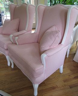
After - Upholstered by the great Lee's of Norcross, GA in a red and white cotton ticking!
See my website - link

GILDED MIRROR REDO with ASCP

I had a mirror purchased about 10 years ago (cheaply) from Home Depot which was a very bright brass color.  It did have beveling and the frame was solid wood (not plastic).   So, instead of automatically including it in my next garage sale, I thought I would take a quick shot at making it work in my newly renovated terrace level.  I don't think you can ever have too many mirrors!  

Here are the very few steps I took to redo and the finished product is proudly displayed below:

1)  Nothing to clean or prepare
2)  One coat of ASCP - Graphite loosely applied
3)  Slight sanding of edges to bring the gilding and undercoat of reddish wood through
4)  One application of dark wax
5)  Slight buffing 

And here's another TIP I am happy to share.  Goof Off (see above) works very well to remove paint from the mirror and to use as general clean-up.  Easy to do and great results with no damage on mirror surface.

I love my NEW mirror and am looking at other similar type mirrors to do more of this - it is certainly a good way to make old mirrors new again!

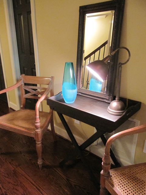
Mirror in Terrace Space.  More on this table (also ASCP'd) later!

These projects are linked as follows:  Southern Hospitality and French Country Cottage

Wednesday, September 19, 2012

Seafoam Dreaming


Console Table in Seafoam Blue at Scott's Antique Market
I have just finished renovating my lower level and was thrilled to include my new favorite color, seafoam blue, in this setting - link to post about renovation.  I love the coolness of this great combination of blue and green.  It is a relative to both turquoise and gray-blue.

Earlier in the year, I reported that the color "wythe blue" was one of the HOT colors of 2012 - link to post about Benjamin Moore 2012 colors - it is a great name but is really the same as seafoam blue!
Calico Corners

 Pottery Barn
I continue to find seafoam blue in all may favorite settings and this posting is a summary recent photographs confirming that everyone loves this great color!
Seafoam Blue Bedding at Calico Corners (I love it with this shade of green)
Clock (a little more turquoise but I love it) at Scott's Antique Market
Seafoam-ish bench at Scott's Antique Market - I HAVE to get that sign!
Scott's Antique Market 
Bedding at Pottery Barn
Scott's Antique Market
Pottery Barn
Scott's Antique Market
Love some of these seafoam blue fabrics in my inventory! 
Nice combination - I hope to get photos of these in their new setting.
Well, I hope that this color is not just a 2012 fad but one that lives on and on!

Monday, September 17, 2012

Visiting Florida Keys Design Center - Coastal Design


I just returned from a wonderful (but hot) vacation to the Florida Keys with my husband.  It is a lovely area and although this is still hurricane season, we had wonderful weather and fabulous sunsets.  One of the nice things about traveling is the opportunity to see design influences in different areas.  Clearly, the Keys are influenced by the water which is everywhere and the tropical setting.  We stopped at a design center in Marathon which is about halfway between Miami and Key West.  I took these photos at the center and was delighted to see that my most recent home project's (see Terrace Level Renovation) color scheme of seafoam blue with sand and charcoal was well represented in their decorated spaces.

Doorway to design center - love that large shell above door! 
Love this pattern - this could be one of my sets. 
Lots of caning and bamboo ..
Nice chair combination!  I like different hostess chairs at the ends of the table. 
Love all the greens!
Colorful group with just a little of the beachy feel!
More lovely greens ...  
Sand-hued - very popular at the Center ... 
Seafoam plankboard walls - nice!
I love this bed - have been thinking about an upholstered frame for my own space. 
Lovely table-scape! 
More seafoam and sand ... 
Love that coffee table - reminds me of my Annie Sloan Chalk Paint projects,

Clearly a coastal theme ...
I like the "sea glass" description on these popular colors - represent well the color schemes at the Center. 


I have a special love for chaise lounges and this one is wonderful!
Of course, the classic blue and white is always in style and season!
I fell for this lovely console table - would have liked it for myself.


Another ASCP reminder ...


This is close to the size piece I am looking for to add to my terrace level project - narrow, long and stylish! 
My friend Ouida loves roosters and this reminded me of her. 

A little over the top for me but clever! 

This actually is a photo of the bed and breakfast room we booked in Key West - sweet but not quite up to new decor standards!
 We loved our trip and I appreciated my husband's indulgence in letting me visit the Design Center.  For those traveling in the area, it's right on Highway 1 - can't miss it!