 |
| Check source through my Pinterest Board - link |
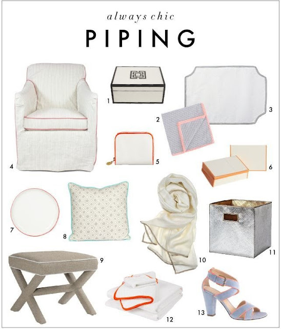
I have always liked the crisp look of contrasting piping on upholstered pieces (and other items as well as illustrated in the board above). Using another fabric and/or fabric color to highlight the edges and curves really makes them stand out. I have developed some personal rules about using (or not using) contrasting piping but first I wanted to check in with the experts and bloggers on the subject.
Contrast piping is
… a great way to add a little pop of color and turn something average into
something amazing! I really like it in small doses. An entire sectional or
living room set is too much for me, but on pillows and cushions, headboards, or
armchairs--it's great! It really makes something look more tailored and
finished, and can tie it in with the color scheme of the rest of the room. link to At Home in Love blog.
Another source (Houzz) provides some rules about using contrasting piping:
Piping Moves Furniture to the
Head of the Line
Boldly defining upholstery lines,
contrasting piping underscores the strength of a furniture piece's design
A white chair
feels fresh and current outlined with black piping.
When choosing
piping, correlate with other aspects of the room so the furniture still feels
cohesive.
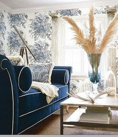 |
| Good example of boldly defining upholstery lines - see link below |
For a subtle
aesthetic that creates just the right amount of dimension, choose a contrasting
piping in a slightly darker shade than the upholstery.
Edge patterned
fabric with a color from the print for a bold highlight. link
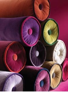
I even found a pinterest board devoted to use of contrasting piping with some images as shown below -
source
 |
| Another good example of boldly defining upholstery lines from link above. |
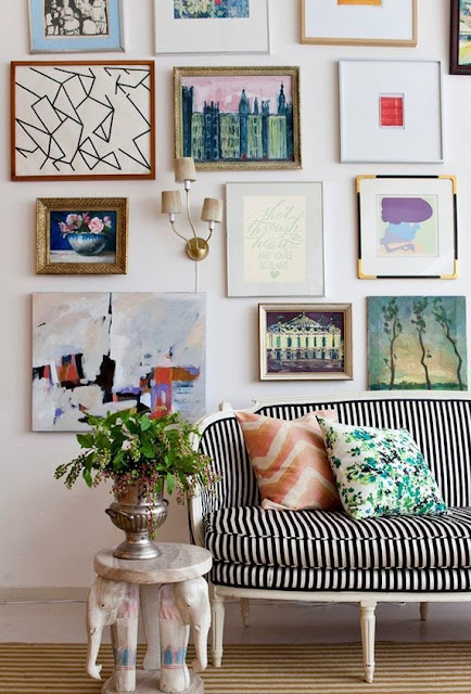 |
| I love the way in which the piping on this piece shows off the woodwork - one of my reasons for using contrasting piping as described below - from my pinterest images. |
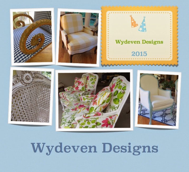
I looked at some of the ways I have used contrasting piping over the years - my best photo records only go back to 2010 so that is as far back as I looked. Here are the images from those years.
In reviewing my own use of contrasting piping on upholstered furniture, I have concluded that I follow these general guidelines - many are unique to my circumstances and may not be applicable to others.
- I do not want to limit the use the pieces have in a variety of settings. While I love the idea of using contrasting piping in bright shades like reds and yellows on more neutral pieces, I know the color additions will make it hard for people who I am hoping will buy my great pieces to use in their setting. So, I use contrasting piping of a shade/type that does not limit the flexibility of the pieces.
- I love the look of nailhead trim on upholstered pieces and how they enhance great woodwork as well as interesting angles. Using them, however, adds significantly to my costs (and, therefore, costs I would have to pass on). So, I use contrasting trim to mimic the look of nail heads particularly when applying chalk paint (a good example is the settee in the 2013 collection)
- I have used the reverse of a fabric several times to create a contrasting piping that is still fully within the pattern/color of the primary upholstery work. This can best be done with good woven fabrics that have clear colors on both sides or solids that might have a little variation on the back - lighter or darker.
- I like using contrasting piping to add texture and have used a heavily textured solid with a smoother solid of the same color group to create the custom look.
- I have used contrasting piping when I am short of materials - sometimes the ability to use another fabric can stretch a slightly too small piece to fit. Because piping is cut at an angle, it does require a good sized piece of fabric.
I would love to use more contrasting piping but have pretty well stuck to the above rules. For my home (or anyone's home) a more liberal use is a great idea and certainly gives the place a much more decorated and polished look!


No comments:
Post a Comment